You have /5 articles left.
Sign up for a free account or log in.
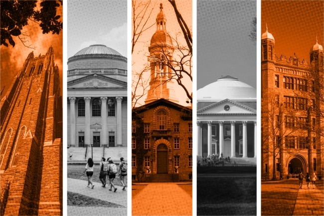
Inside Higher Ed’s affirmative action database uses first-year demographic numbers from 25 colleges, including, from left: Duke, UNC Chapel Hill, Princeton, the University of Virginia and Yale.
Photo illustration by Justin Morrison/Inside Higher Ed | Lance King/Getty Images | Eros Hoagland/Getty Images | Smallbones/Wikimedia Commons | Joe Sohm/Visions of America/Universal Images Group/Getty Images | f11photo/iStock/Getty Images
Demographic data for the Class of 2028 is in high demand this fall. One year after the Supreme Court struck down affirmative action, higher ed leaders, families, lawyers and policy wonks are anxious for a more concrete picture of what racial diversity looks like without it.
That picture has begun to emerge over the past two months as colleges release their class profiles. Inside Higher Ed has gathered institutionally reported data from more than 25 universities and broken down the numbers into an interactive database, which we’ll continue to update as more institutions make their first-year demographics available.
The project is largely based on publicly available data released at the start of the fall semester, both in 2023 and this year. Colleges typically break down their class demographics by percentages, and the way they calculate those figures can vary; for example, some count only domestic students while others include international students. If colleges released more than one data point in a given category, we opted for the more inclusive number.
An Inside Higher Ed analysis of the data is, so far, inconclusive. The results vary widely, from double-digit drops in underrepresented minority enrollment to small bumps. For the majority of institutions, incoming class diversity has remained relatively stable over the past two years. And while the general trend points to an overall decline in Black and Hispanic enrollment—in particular among the Ivies and small, highly competitive liberal arts colleges—a few key factors make it difficult to draw broad conclusions about the Class of 2028.
One is a marked uptick in the number of students who declined to report their race. At institutions that reported this number, it increased by an average of about four percentage points—a big jump in a category that’s usually below 5 percent of a class, doubling or tripling at some institutions. For many colleges in this data set, that increase is greater than the change in underrepresented minority representation for most colleges, which raises a crucial question: Are the numbers going down because fewer of those students are being admitted, or because they’re less likely to report their racial identity?
Another caveat: Some institutional data points appear to add up to more than 100 percent because they count students who identify as multiracial in multiple categories—as the two or more groups they include in that definition—while others count multiracial as its own exclusive category. Certain institutions’ data may also appear to add up to slightly less than 100 percent because they have yet to make data for all racial groups publicly available.
The data are riddled with these kinds of hairy complications. Inside Higher Ed found three different sources for demographic data from the University of North Carolina at Chapel Hill’s Class of 2027, and all three had different numbers, varying by up to 10 percentage points.
A Chapel Hill spokesperson explained via email that the discrepancy is because those sources varied in data inclusivity: One source included international student numbers, one includes transfer numbers in addition to traditional first-years and one includes neither.
Another reason to be cautious is the apples-to-oranges nature of many institutional comparisons. Nicole Curvin, dean of admissions at Middlebury College, told Inside Higher Ed last month that she’d hesitate to compare changes in underrepresented minority enrollment even among small liberal arts colleges.
That’s because many are starting from vastly different points. Middlebury’s 1.5-percentage-point decline in Black students, at first glance, seems like a sign that the college was better prepared for the affirmative action ban than fellow New England liberal arts college Amherst, where Black enrollment dropped by eight percentage points. But Amherst had far more room to fall: its Class of 2027 was 11 percent Black, while Middlebury’s was 5 percent. This fall, the two are about a percentage point apart.
Curvin said that comparisons between institutions far less similar than Middlebury and Amherst—both of which two have been overwhelmingly white until very recently—are even harder to make.
“We’re a small college, and so all our percentage-point changes are magnified,” she said. “We’re also starting at a lower value than most colleges. It’s only in the last 15 years, really, that smaller liberal arts colleges have gotten more diverse. That history absolutely has an impact.”
Beyond the variations in institutional data collection is a simple reality: It’s only been one year. A trend is, by definition, derived by comparing more than two data points.
So, by all means, pore over this data, analyze it, pick it apart. But as colleges start to formulate new strategies for diversity post–affirmative action—and look back at the numbers to determine what worked and what didn’t from the past year—it’s important to remember how inconclusive and blurry the picture they paint actually is.
Explore the Data


