You have /5 articles left.
Sign up for a free account or log in.
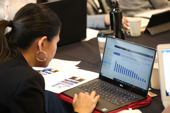
Members of the California State University system can view institutional and systemwide data on the CSU Student Success dashboard.
California State University
Making informed decisions toward student success outcomes requires data, and leaders from the California State University system created a data dashboard exclusively to measure student success and equity.
Since the launch of the dashboard, CSU has seen improvements across the system and within the classroom, benefiting all stakeholders—and particularly students.
What’s the need: In 2015, CSU officials created a 10-year plan to increase four- and six-year graduation rates among first-time students and to raise two- and four-year graduation rates for transfer students.
CSU’s goals are to promote first-time students’ graduation rates to 40 percent for four-year completion and 70 percent for six-year completion. For transfer students, the goal is a 45 percent degree completion rate in two years and 85 percent graduation rate in four years.

California State University
The plan, Graduation Initiative 2025, is a systemwide strategic effort around student success and equity, but it hinges on data-based decision-making and data visibility, explains Jeff Gold, assistant vice chancellor for student success at the California State University Office of the Chancellor.
In fact, data-informed decision-making is one of the six implementation measures of Graduation Initiative 2025, alongside creating academic preparation, enhancing enrollment management, supporting student engagement and well-being, investing financial support, and removing administrative barriers.
What it is: The dashboard is a highly customizable tool that allows stakeholders of all experience levels to visualize and work with data from across CSU’s system. The dashboard is available to faculty members, staff, advisers and administrators across all departments and divisions at CSU.
While CSU’s data analysis has been around for many years, the CSU Student Success Dashboard is a more recent phenomenon. What makes it different is that it’s only student success data—nothing about enrollment management or fundraising, for example—and it was built in-house by CSU, for CSU.
“We have a spouse rule—most of our partners do not work in higher ed, and if they can’t look at the dashboard visualization and, within 30 seconds, have a general idea of what it tells us, we need to revamp it,” Gold says.
The dashboard groups data into four pools: Graduation Initiative 2025, Faculty Dashboard, CSU by the Numbers and Equity Gaps Dashboard.
- Data in the Graduation Initiative 2025 category show CSU’s progress toward its goals, how quickly students are advancing through programs, which courses have low passing rates and data about students who drop out.
- The Faculty Dashboard breaks down student data by college and degree program, so individual faculty members can analyze course completion, time to degree and academic outcomes among only their students at their campus.
- CSU by the Numbers offers comparisons across campuses in the CSU system, so San Diego State can evaluate how quickly its first-years graduate versus those at CSU Los Angeles, for example.
- The Equity Gaps Dashboard addresses questions like where the equity gaps on each campus are, what academic behaviors are most helpful, which courses create grade point average equity gaps and how students at junior status graduate at equitable rates.
A notable feature is how the dashboard pulls historic data to fill gaps.
“We think it’s critical that everyone’s seeing themselves in the data, even when the sample sizes are low,” Gold explains.
If a user wants to disaggregate data down to a very specific demographic type, say, a male student who is a Pacific Islander and Pell Grant–eligible, and the statistical analysis around graduation rates for that student, not every CSU campus has statistically significant data—or, in plain English, a population of 10 or more students who hit those demographics.
To bridge that hole, the dashboard will go back through the past decade of data until it has enough points, or in this example students, to offer a statistically significant sample size.
The impact: The dashboard is heavily trafficked, with around 25,000 annual visits, Gold explains. Faculty members are the primary users.
Due to the dashboard, CSU has been able to identify gaps and trends in student outcomes and create actionable change, as demonstrated in a report by Mathematica.
One example is at California State University, Sacramento. Sharon Furtak, a professor of psychology, found data that indicated nearly one-third of psychology majors were exiting the department after their first or second year. Using those data, she redesigned an introductory course, which was causing students to stop out, to be more inclusive. That led to increased retention among diverse students.
At California State University, Channel Islands, Richard Yao—then vice president for student affairs and now president—noticed a 20-percentage-point gap in retention among struggling first-year students who had met with an adviser versus those who didn’t. As a result, Yao and his team implemented strategies to connect all struggling first-years with advisers.
CSU is slowly closing in on its graduation rate goals for 2025, as well. As of 2022, the system is five percentage points shy of its four-year goal and eight percentage points away from its target for first-time graduation rates. For transfers, CSU is within five percentage points of its goals for two- and four-year completion rates.
Next steps: California State University system leaders have begun marketing the dashboard to other institutions. CSU holds a patent for its dashboard and, over the pandemic, staff refactored its code to accept data from non-CSU institutions to license it.
Five outside institutions are now using an adapted version of the CSU Student Success dashboard, including Oakland University in Michigan and Kean University in New Jersey.
As more institutions utilize the dashboard’s features, CSU leaders plan to expand visualization opportunities, like faculty diversity analysis.
“It’s a really nice synergy,” Gold says. “The partnerships with universities that are licensing this continues to make us … better and make the development richer, and informed by a wider audience of folks that are every day focused on student success and equity.”
How is your university system or institution using data-based decision-making to promote student success? Tell us about it.