You have /5 articles left.
Sign up for a free account or log in.
Hey science, your posters stink.
Mike Morrison, a Ph.D. candidate in organizational psychology at Michigan State University, is way too polite to say it that way. But that's the implicit message behind his #betterposter campaign for less cluttered, more user-friendly scientific conference posters.
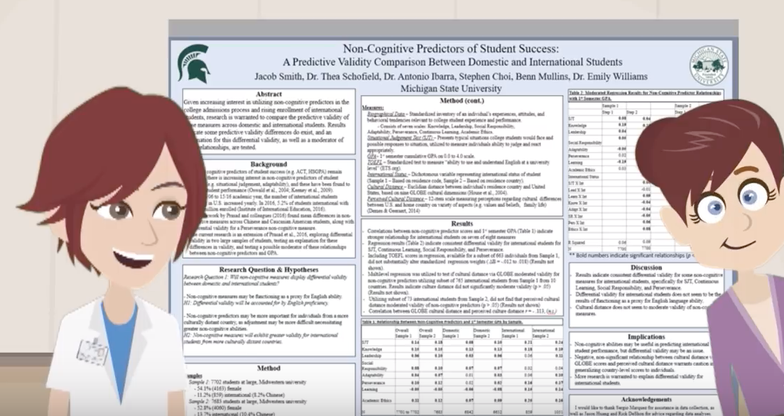
If you've ever been to the poster hall at an academic conference (typically in the bowels of some big city chain hotel), you know what Morrison's talking about: rows and rows of giant boards alerting passers-by to the newest research in the field. These posters are supposed to serve as jumping-off points for scientists to discuss their work and -- as Morrison tells it -- efficiently convey new insights to someone navigating the hall in an hour or less.
The typical conference poster, which is long on information and short on design, fails on both points, Morrison says. That's because an eager scientist usually asks if you have any questions before you've even started to read the darn thing, taking up much of that hour. And the tiny print on all the remaining posters makes them impossible to skim before you've got to run off to some panel, interview or meet-up.

Source: YouTube/Mike Morrison
"The cardinal sin of every poster I've seen, including the posters I've designed myself, is that they assume people are going to stand there and read our posters in silence for 10 straight minutes, following the order of the sections we've laid out," he says in a YouTube #betterposter video that's been seen more than 224,000 times.
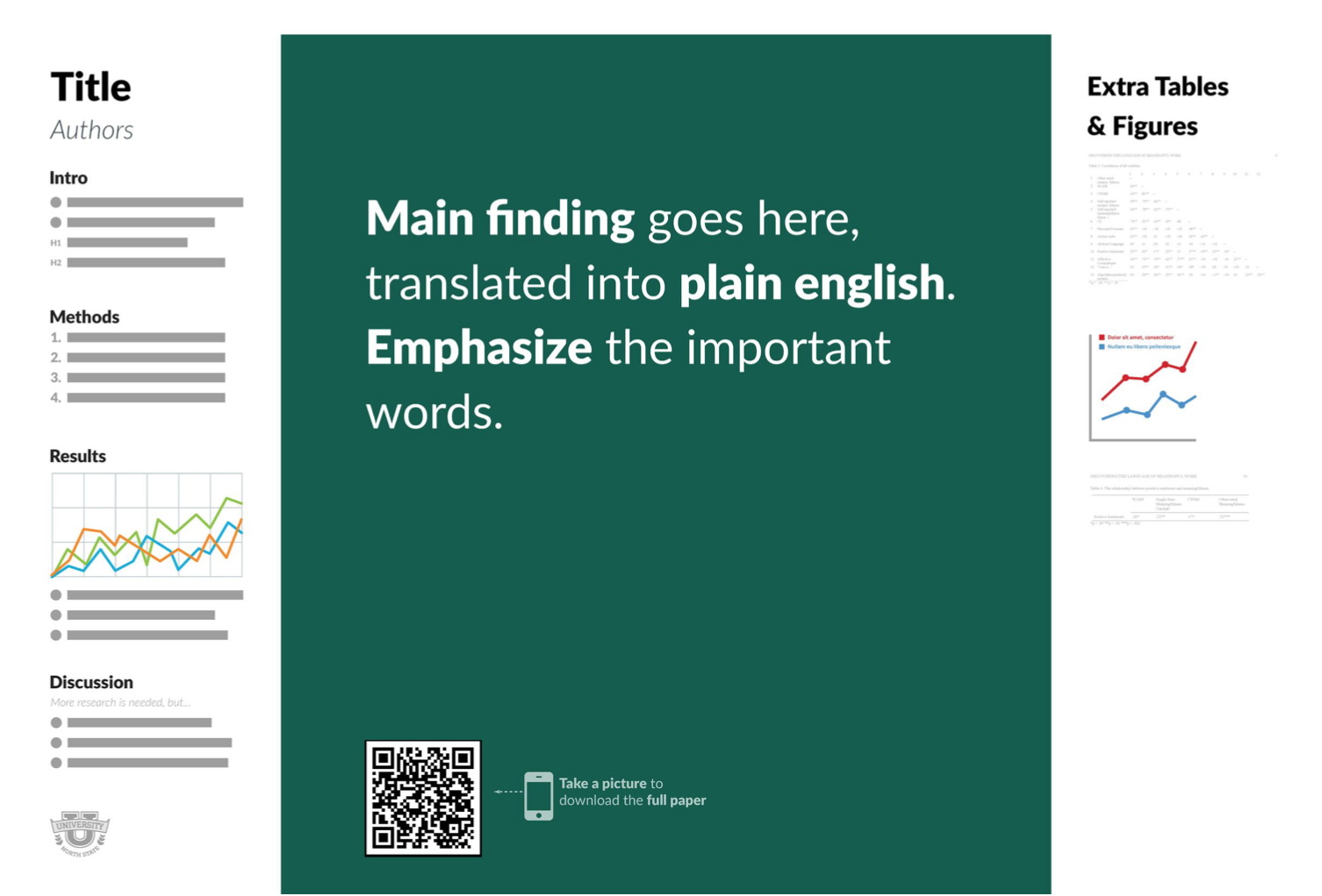
Morrison thinks there's a better way, and that it looks like some version of this:

The #betterposter template boils down the conference poster to what Morrison thinks are the essentials: a main finding, in big type and plain language; an "ammo bar" of data for presenters to use while they're talking to conference attendees; and a "silent presenter" bar with bullet points introducing the study, its methods and results.
Follow the template and you'll achieve the big three conference poster goals, Morrison says: maximize insight transmitted to attendees, keep it easy to make and include what people "need to know," not necessarily what's "nice" for them to know.
Morrison advises topping it all with a QR code linking to a full version of the study and a copy of the poster. He assures followers that this kind of code is "stupidly easy" to make and will better serve conference attendees who take pictures of posters.
The Bigger Picture
Scientific posters are actually what Morrison calls the "lowest-hanging fruit" in his bigger agenda to make science more efficient. (He's published another YouTube video of a talk on that topic.) He thinks it's unbelievable -- even negligent -- that it takes up to two years to see an article published. And he thinks it's just as bad that information typically sits behind a journal paywall upon publication, instead of being shared freely. In this sense, Morrison is butting up against a culture clash between those who would keep science among institutionally-affiliated colleagues and those who believe that science is a public good. He knows that, but he's undeterred.
Morrison's own past as a web developer specializing in user experience makes him especially sensitive to inefficiency. If it takes too long to load something when you're designing a website, it means lost clicks, he said in a recent interview. But in science, it can mean life and death.
“I'm not just talking about curing cancer faster. I'm talking about curing every disease faster. And solving poverty and hunger faster. And reaching the stars faster. Those are the stakes, and that's the opportunity."
Of the conference poster, in particular -- an admittedly small piece of the puzzle -- Morrison said, "It's a bottleneck to learning within science. So if we can improve the learning efficiency of that common design, even by a tiny bit, we can uncork the bottleneck and create massive ripple effects across science."
Morrison has seen accolades across academe for his design. A simple search for #betterposter on Twitter turns up praise from scientists who have tried it and seen positive results, or from those who plan to. Scientists are trained to be critical, so the response has been "overwhelmingly positive," he said, noting that some fellow scientists have won "top poster" nods at their conferences using his template.
Criticism
Morrison also has detractors. Criticism centers on his past assertions that scientists don't think enough about design, because they're not trained designers, as many scientists have previously offered thoughtful suggestions on how to poster design.
Others say Morrison's approach is too extreme.
Teomara Rutherford, assistant professor of educational psychology at North Carolina State University, said recently that the #betterposter movement "would be great if it got people talking about design and being thoughtful about how design principles could be used for their individual posters, but that's not what has happened." Instead, she said, "people have been very quick to adopt an untested format on the recommendation of a splashy video."
Just as Morrison is predisposed to thinking about the user experience and efficiency, Rutherford -- whose research focuses on educational technology -- is predisposed to a certain kind of skepticism.
"There are a lot of complaints about ed tech being a solution from outside of education that is often plopped into classrooms and expected to solve all manner of issues," she said. And many researchers "now recognize that we first have to understand the needs, experiences and existing skill levels of teachers and students and work with them to find technology solutions that fit within the context."
In other words, Rutherford wants more research on whether #betterposters are, in fact, better. That discussion has to start with the goals of poster sessions, and with a better understanding of attendees and presenters alike, she said. Morrison has talked about the role of poster design in information retention, for example Rutherford said, but retention hasn't been an aim of any poster session she's attended.
Guessing that the likely goal of a poster session is engagement with scholars who are "highly knowledgeable and motivated about a very specific topic," Rutherford said they will want to see and talk about data and methods in depth. And while it may be difficult for conference-goers to find the five or 10 relevant posters in a crowded hall, she added, "we might be able to solve that just with better titles."
Further research questions on better posters might include, "How should we present data and text to aid in scientific discussion?" Rutherford said, and, "What is the flow of a general academic elevator speech about the study and how does the poster layout match with that?"
Morrison said that a recent comprehensive literature review found no evidence for posters' efficacy as a tool for knowledge transmission. He also underscored that the template is based on research on user experience design.
An exit survey of attendees at a recent conference of all #betterposters found that 68 percent of attendees preferred even a plain #betterposter layout to the traditional poster design, Morrison noted. Still, he's planning on multiple additional tests and side-by-side comparison of multiple formats at a conference next year. The idea is to see what works best, not just whether the current #betterposter template works.
"It's been tricky to get scarce conference real estate reserved for pure experimenting just logistically, but we now have organizers from virtually every field ready to help," he said. "Ultimately, we are planning to test specifically for learning outcomes and attention directly."
Martin H. Trauth, a geoscientist at the University of Potsdam in Germany who has written about science communication, including the scientific poster, said a poster is really a "teaser to attract people that are not exactly working in your area. The ones that eventually help you to move forward, because they have some overlapping knowledge and interest."
To attract that audience, he said, “your poster needs to be beautiful, with a very short and attractive, meaningful title," something like the main conclusion of the #betterposter design.
"You stand next to the poster, smiling, and you start communicating with your possible future collaborator," Trauth said. If you're not there, the poster should also work. That's "why we need content, but not too much, nice and simple."
Trauth said that he supports a movement toward better posters, "in principle." In his graduate course on science communication, for example, he asks students to review 10 posters and guess which won awards. There is a typically little consensus. In reality, all have won some kind of award and none, in Trauth's estimation, is really great. That's in part because awards tend to assess content, not design, he said.
Of #betterposter, in particular, Trauth said that users' examples show that they are still putting too much information on their boards, but now also "wasting a lot of space on a central statement." That means there is much less space for "real content," he said.
Try It First
Morrison's response to his critics? "Please try it before you knock it."
"If it's too extreme for you and you find yourself missing certain elements," he said, "then add them back for the next conference. Start from scratch and add up. Don't start from everything and boil down."
Morrison added, "I can guarantee that you'll learn something about what works and doesn't from trying the #betterposter layout, whether you decide to scrap it or not."
So far, Morrison has just talked about the need for better posters in science. But many fields outside the natural sciences use posters, too. And academics in some of those fields have previously thought about how to make those posters better.
Colin Purrington, a professor of biology at Swarthmore College who has written about posters, said the design problem is compounded because PowerPoint templates are passed on through departments. There's typcially a “poster person” who has a template that everyone seems to use, he explained. And that poster is "invariably bad, with "no emphasis on good design, such as pleasing use of white space and graphics."
Then, he said, disciplinary societies and conference organizers "choose one of these dense templates to push onto conference attendees, for decades. The result in most sciences and non-sciences is conferences are full of posters that are unreadable. It’s really hard to undo a template in a field once it has been posted on a meeting site. Like a mutation, it’s there until the person dies."
Purrington said that he used to advise adding QR codes to posters, but that the idea didn't really take. In general, though, he said, "posters in all disciplines would benefit from fewer words and especially fewer logos."
"I wish conference organizers would just enforce a word limit -- 500 words max, for example, might counteract the innate tendencies for academics to overshare. One can always hope."


