You have /5 articles left.
Sign up for a free account or log in.
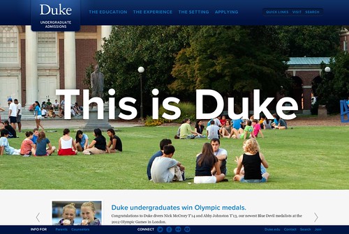
When Cara Rousseau, social media manager for Duke University, emailed me about the new Duke University Admissions website, I was immediately intrigued. With a stated goal of wanting to "create a true-to-life Duke experience within the digital space" that focused on the "student voice and student-to-student interactions, the new site is mobile-ready and built upon quality storytelling. One particularly notable aspect of the new Admissions site is that it incorporates a longer, scrolling page design. Christoph Guttentag, dean of undergraduate admissions at Duke, shared his thoughts with me about the new site:
Could you describe your overall communications strategy for Admissions as it relates to the web (including mobile) and social media?
We want to make sure our viewers understand the qualities of Duke that are particularly unique and appealing; we want students to be able to picture themselves at Duke; we want those who seek to understand Duke and the admissions process--students, parents, secondary school personnel, alumni--to be better informed about how we shape our student body and enthusiastic about what we have to offer our students in their lives as undergraduates and as alumni.
I believe that at heart we as humans are wired for narrative and images, and we want to use those as often as we can to communicate with the public. Finally, we didn't go into this project simply to redesign our website. We wanted to create a digital experience for prospective students and their families that would let them understand why Duke would be the right choice for them and at the same time help the university come alive for them.
Why is mobile an important aspect of your strategy?
The amount of communication that occurs--among young people and adults--with mobile devices is radically different than when the modern era of admissions began. The important thing is to adapt the core messages to the platform. And to remember that you rarely go wrong when you meet people where they are, and take them where they need to go.
What was the process of trying to create a true-to-life Duke experience within the digital space? Was it by committee, with an external vendor, or a combination? Any particular challenges?
A combination. We did hire an external vendor, Viget, who have an office in Durham, and who worked very closely with us throughout the project, both in determining the messages we wanted to present and the style in which that would be done. It was a full collaboration, led on the Duke end by Blyth Morrell and Cara Rousseau, with extensive participation from the News and Communication Office and staff from the Admissions Office. At times there were disagreements; often it made sense to follow the professionals, particularly in areas of design, at other times we on the admissions/administrative side needed to decide what to say or how to say it. One large challenge - and opportunity - was starting from scratch, and significantly reducing the number of pages and links people had to use to navigate the site and find what they needed.
Were current students part of the creation process? Will you be using student feedback to evolve the site over time?
We conducted student focus groups and interviews at the begin of the project to capture the student perspective. We've already received a good amount of positive feedback from current students since the launch, and we'll be using both analytics and feedback to help improve the site and its usefulness over time.
You mention storytelling as being important. How are you incorporating storytelling into the site? Do you have a content strategy?
Storytelling, through text or video, will find its place wherever we want the audience to learn more about a person, program, or opportunity in depth. There are times where simple lists, facts, or descriptions are more appropriate, but to fully understand what makes Duke and its people special, stories are essential.
Success for Admissions is generally fairly simple - applications. Is that the goal for this site or is it something more?
I wish it were only about applications! My work would be much simpler. Success for admissions is about many things - first among them creating the right class for Duke right now. That means attracting applicants who have something to offer Duke and who are ready to take full advantage of what we have to offer them. So our task is to describe Duke in a way that is appealing, accurate, understandable, and as irresistible as possible. That's our goal.
Any other considerations that went into this project?
Two other considerations. Flexibility - we wanted to be able to update the site easily and quickly. And engagement - we want people to come back to the site and have the chance to learn something new each time.
Thanks to Cara Rousseau for reaching out last week to share the news about Duke's new admissions website with me. The last time I posted something about Duke was my profile of Tim Bounds - "The Controller of Chaos."
I'm always on the lookout for stories that would make for interesting blog posts…keep'em coming folks…just make sure that you read this first.
Do you tweet? Let's connect. Follow me on Twitter.


