You have /5 articles left.
Sign up for a free account or log in.
For years, we’ve seen a growing trend of universities using the same identity mark for their academic and athletic brands. It’s a bold move, and a massive undertaking, but the benefits can be well worth it.
For some administrators, the idea of replacing a cherished, century-old academic logo with a popular athletic mark is unthinkable, especially since many will see it as a slight against the institutional brand and its academic integrity. But for those willing to unite the two sides of the house under one mark -- and the list of impressive universities who have done so is growing -- the combined brand strength is undeniable.


Why does this approach work?
1. It builds immediate recognition.
University athletic marks are more widely recognized by the masses. As the space for brand perception becomes increasingly competitive within higher ed, instant recognition isn’t just a great thing, it’s critical. All audiences, from prospective students and prospective donors to peer institutions and prospective employers, gain a quicker emotional and memorable connection to the athletic mark.
2. It draws on the best-traveled assets.
Obviously, athletic marks get out more. Not only do we see them on television in carefully designed graphics for uniforms, jumbotron animations, fan gear, and playing surfaces, but social media and news coverage ensure that those images live well beyond game time. Academic marks aren’t nearly as pervasive on merchandise, on TV, or online, mostly because except for marketing communications and the in-game PSA, they’re not nearly as portable.
3. It eliminates confusion.
A unified logo approach also eliminates the need to police the intermingling of the two brands. Take, for example, when the school of engineering mixes the university’s athletic mark with its formal academic name. Sure, it makes for a great golf shirt or folder, but it can weaken the brands of both the individual school and the institution, particularly when universities are establishing a comprehensive system for brand architecture.
4. It’s easy to root for.
Finally, borrowing the mark from athletics brings a sense of spirit and pride to the academic side. Universities must maintain enthusiasm for both, so what better way to show it?
Combined brands in action
As we researched schools that are evolving into some version of a combined mark, we found it’s indeed a growing trend, but the approach is varied based on the institution. Most schools adopt the initial capital. The University of Michigan was the one of the first to do it, and the consistency and scale of the block “M” makes it still one of the best.
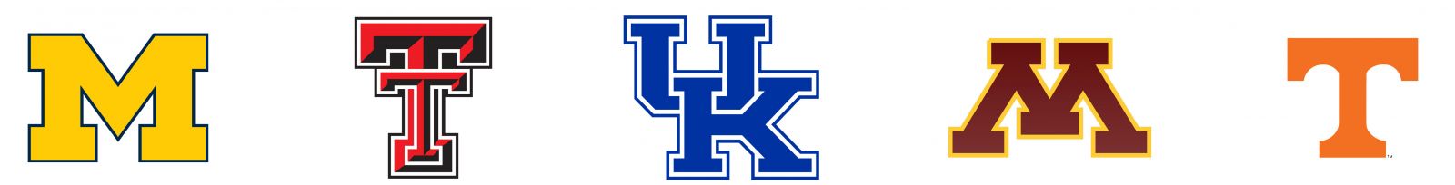
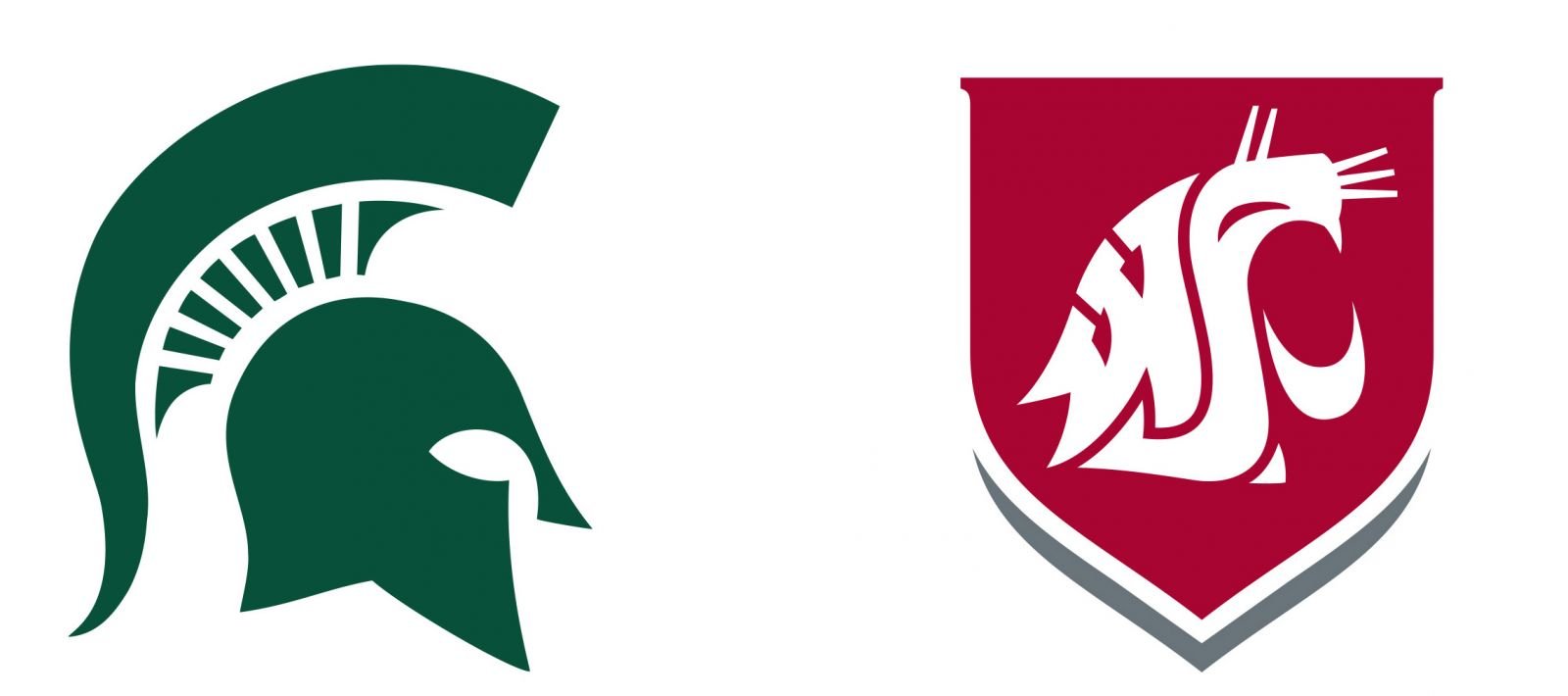
But what happens when your school’s initial is already taken, especially by your in-state rival? Look no further than your mascot.
Of course, these brands are more than their identity marks. Each has clearly designated academic and athletic fonts. One trend of the past few years: commissioning a custom typeface for athletics that harks back to the school mascot.
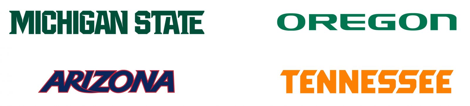
Even for universities that don’t share an academic and athletic mark, custom mascot-inspired typography is popping up everywhere.

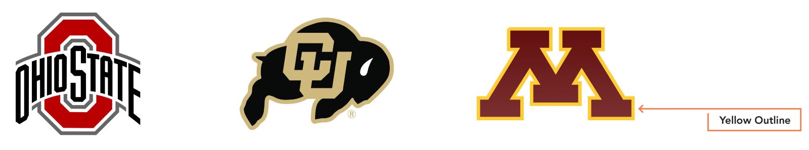
And the logos for each side don’t need to be identical. A handful of schools use the same basic identity for both, but add a minor element to the athletic mark to distinguish it from the academic mark.
In any case, it’s a fun time to be examining identity marks in the industry. One final note: Alumni have intense nostalgia and profound emotional connections to their institution’s marks, whether academic or athletic. So any shift must be carefully considered, well planned, and of course, executed with a meticulous eye toward design.
Kelly Ruoff is Chief Creative Officer for Ologie.